We’ve come a long way since the early days of the web in terms of being able to navigate around a site easily. We’ve moved from keyboards to button-only mice, from scroll-wheels to mighty and magic mice and mutli-touch trackpads. Getting around a webpage is easier than ever.

Horizontally scrolling sites have always been in a minority but seem to have increased in popularity in recent years. We’ve never made one ourselves, partly as it’s only a choice suitable for a certain projects (nearly exclusively portfolio sites) but also the combination of hardware limitations, finger dexterity and need to include additional UI instructions make it a difficult decision to justify. The experience of navigating a horizontally scrolling site with a mouse is simply too much of a usability obstacle.
But the mobile revolution has thrown an interesting curve ball into the mix that few (if any) have yet to exploit. On a smart phone the traditional scroll direction of up/down is maintained for most experiences that with one-handed operation must be used by the thumb. The thumb moves left/right almost as naturally as it does up/down (something the index finger on a mouse does not), a point that has been utilised by some native app experiences such as turning the page in iBooks or accessing additional information in tweetbot. With the introduction of tablets the gesture of swiping your hand led by a finger is as natural as turning the page in a book, but the convention has mostly been to skeuomorphically imitate that page turn metaphor or simply access an additional layers of information inside a traditional vertically scrolling interface. Or simply unlock your phone.

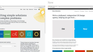
We think it might be an interesting experiment to use a horizontal scroll to deliver a complete mobile web experience. A browser detect could be used to serve a vertically scrolling site to the desktop experience, and a reformatted horizontally scrolling one to a mobile/tablet. We imagine media-queries could probably be used in much the same way with a bit of customization. There would certainly be some limitations with regards to fixing the height as any device rotates but these variables can also be detected today and so the format could rearrange responsively to fit. See our rough example below. We imagine there would other technical challenges in implementing this solution but none so insurmountable to make the idea an impossibility.

Clearly limited to less-copy driven sites still, as the natural reading format of left-right top-bottom, but could this be an area yet to be explored? Have you seen any examples of horizontal scrolling and responsive design used in this way? Is it even possible? We think there’s some untapped potential in this usually unpopular web-design choice. Keen to hear all and any thoughts.
If we get the opportunity we’ll also explore the idea further ourselves. If it works we may even use this in a future project.